Fieldwork
Identity For Export
Corporate typography | design: Círculo Salvo | customer: Inac
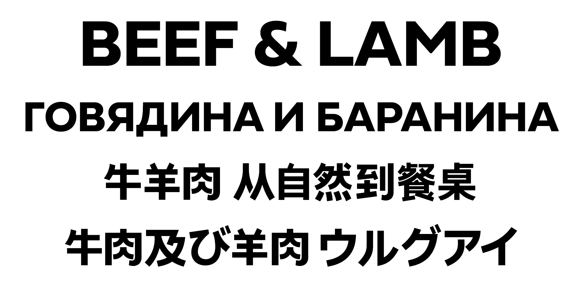
Design studio Círculo Salvo asked us to work on a custom version of our Fieldwork typeface for the brand identity of Inac (National Meat Institute, Uruguay).

It was an important challenge, since meat is Uruguay’s main export and one of the country’s most notable identifying features. We accepted the invitation as an opportunity to make our contribution, through typography, to the construction of a brand that is effectively a nation brand.

On top of that, the institute needed to strengthen their image in the international market, therefore we had to think about expanding the language support to include Cyrillic, Japanese and Chinese. And they had to live in the same design space along with the Latin text used in Spanish. That meant adjusting the visual weight for these distinct writing systems while preserving the clean and modern character of the Fieldwork typeface.

the images are from Inac and Círculo Salvo
