
Rustica
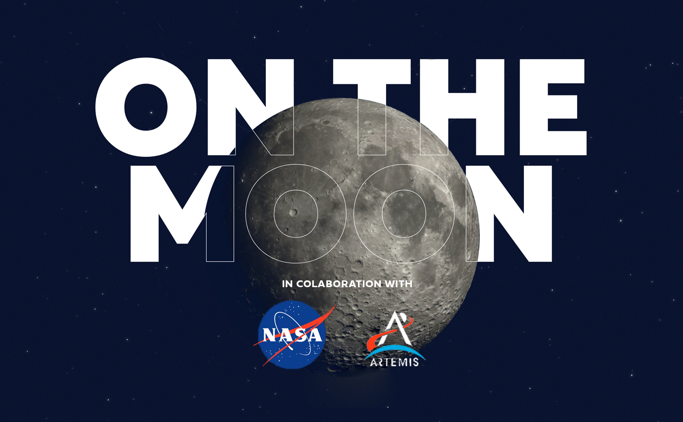
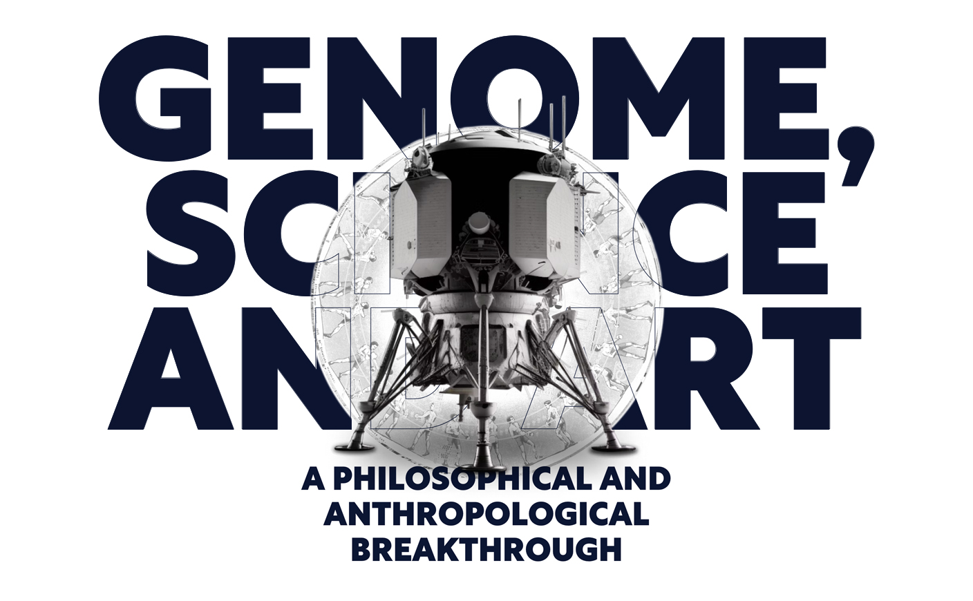
The Rustica Typeface Will Travel to the Moon on NASA’s Next Mission
Corporate typography | design: Graphéine | customer: Sanctuary on the Moon
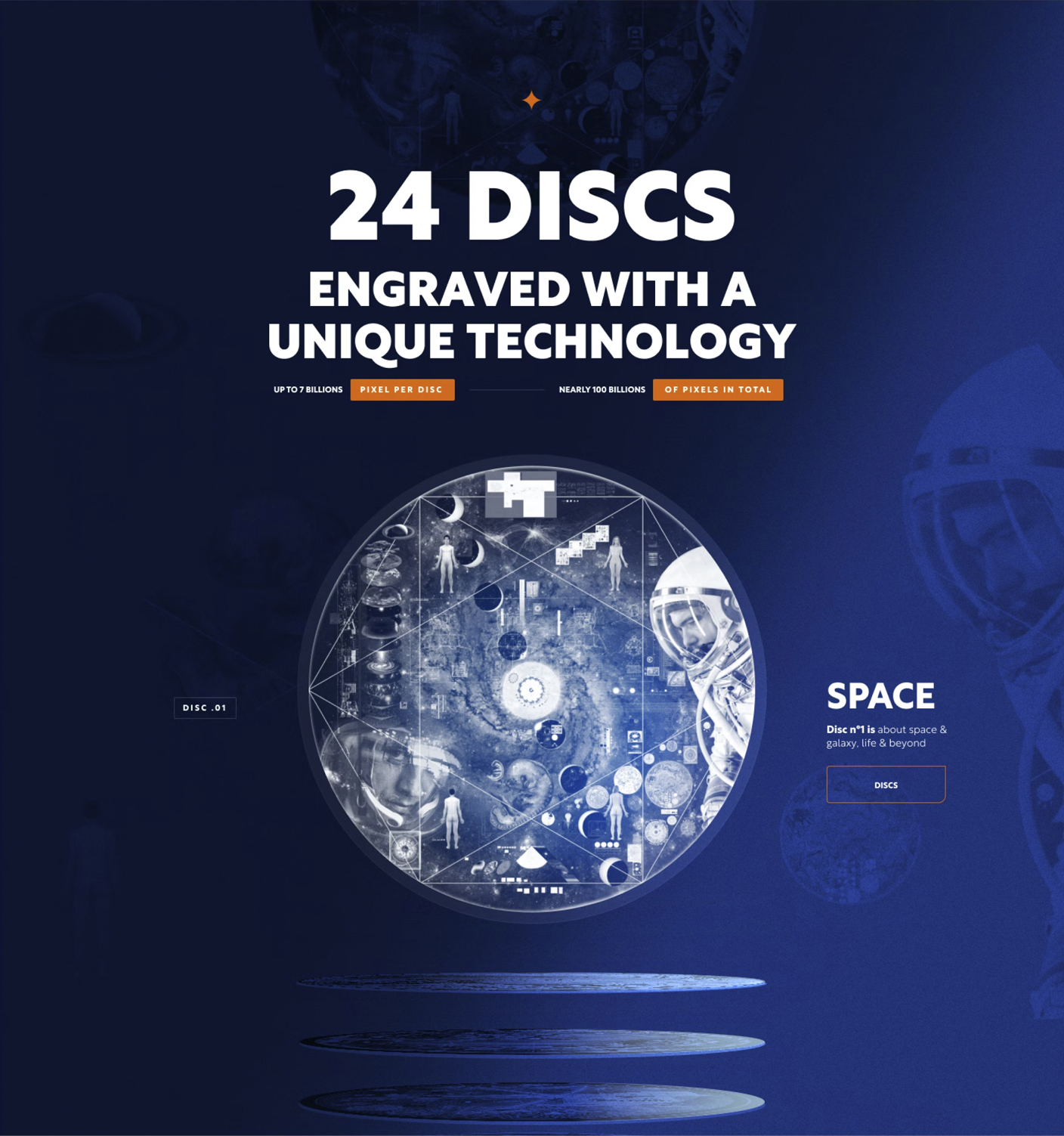
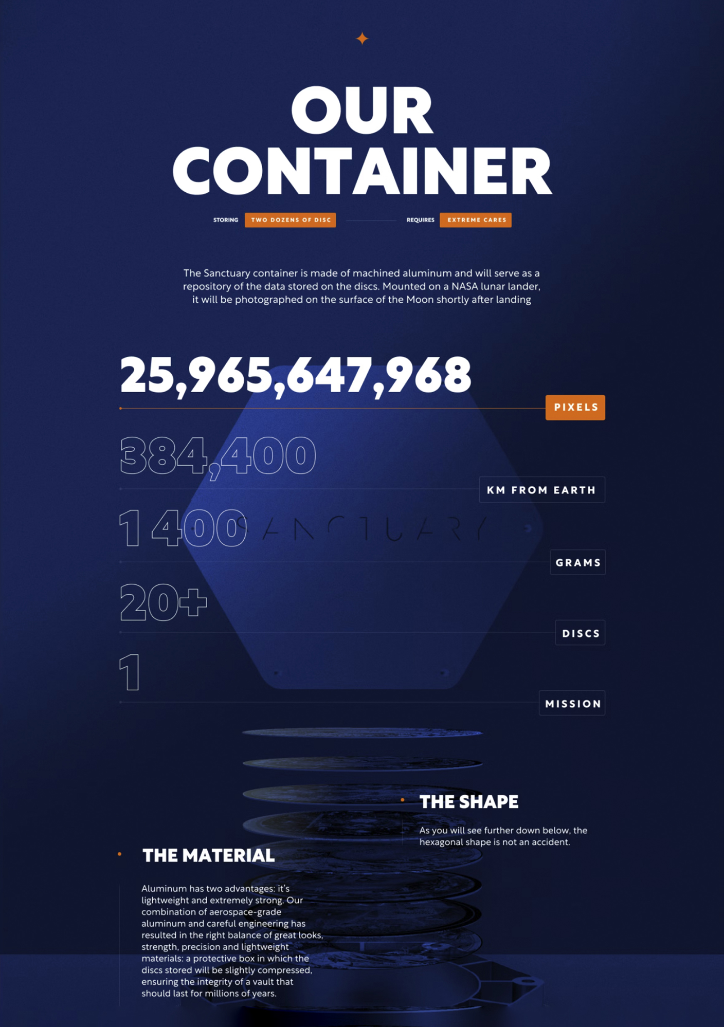
Sanctuary is a time capsule that will contain and preserve a collection of ultra-hard sapphire disks engraved with billions of pixels on the moon as part of NASA’s Artemis program. This time capsule will carry through time a cargo of human knowledge from the arts and sciences.
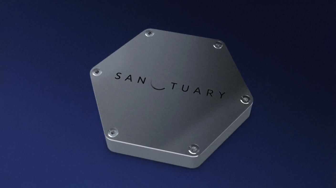
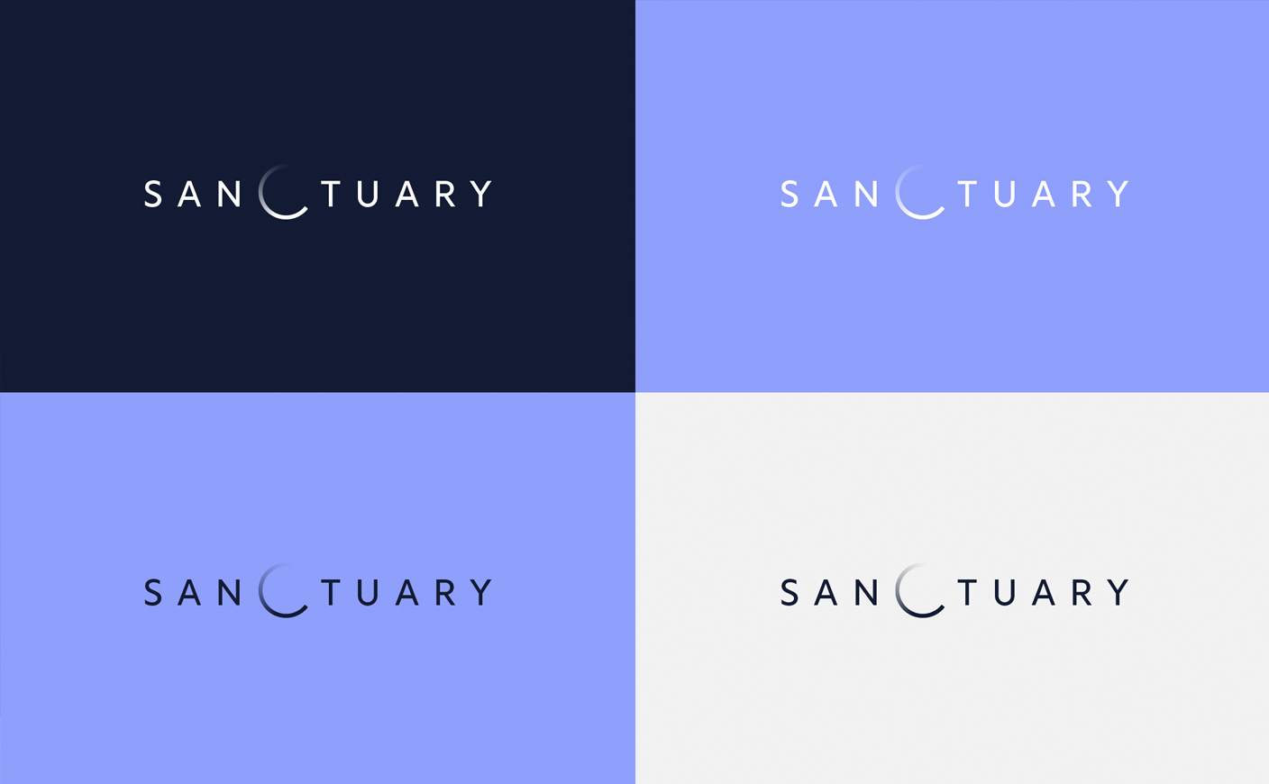
Graphéine was called in to develop the project’s logo. The previous, very futuristic version was not sufficiently legible. They opted for a minimalist logo, taking advantage of the central position of the letter C, which becomes a lunar eclipse. The circular shape also evokes the passing of time, reflecting the project’s philosophical and memorial dimensions.
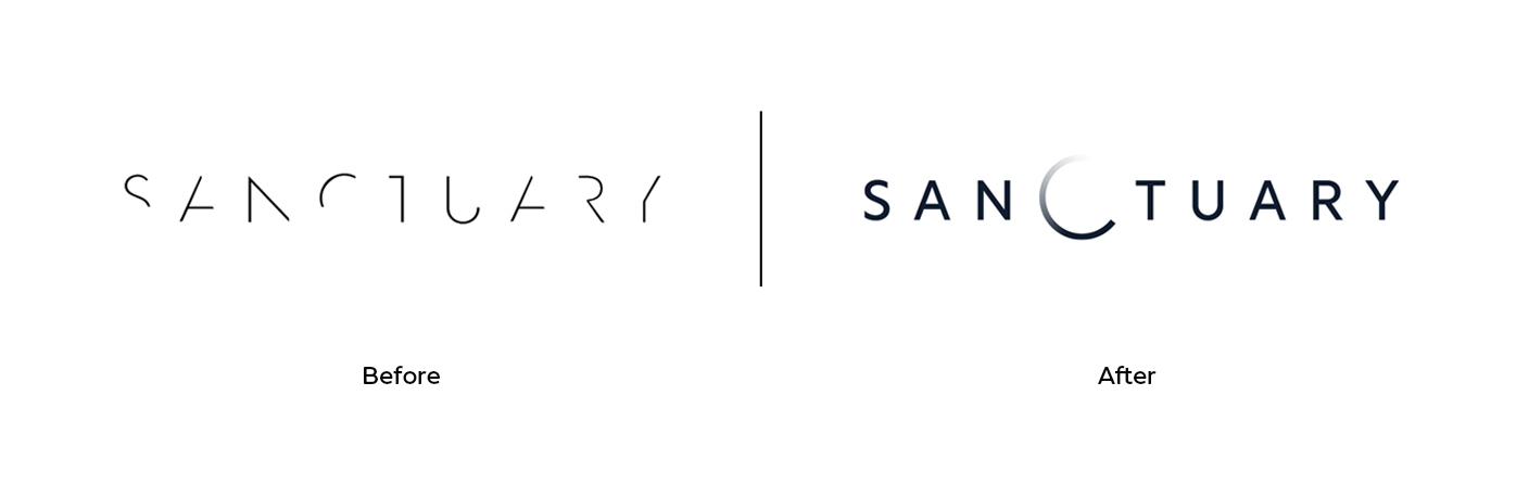
The typeface chosen was Rustica. This typeface is based on a humanist design, with the added precision of geometric linéales. It’s a typeface halfway between yesterday and tomorrow. Rustica Is born out of the DNA of our awarded font Rotunda, contributing to this typographic ecosystem humanist notes enhanced by the precision and discipline of geometry. A typography that, since its conception, adapts very well visually and conceptually to Sanctuary aims.
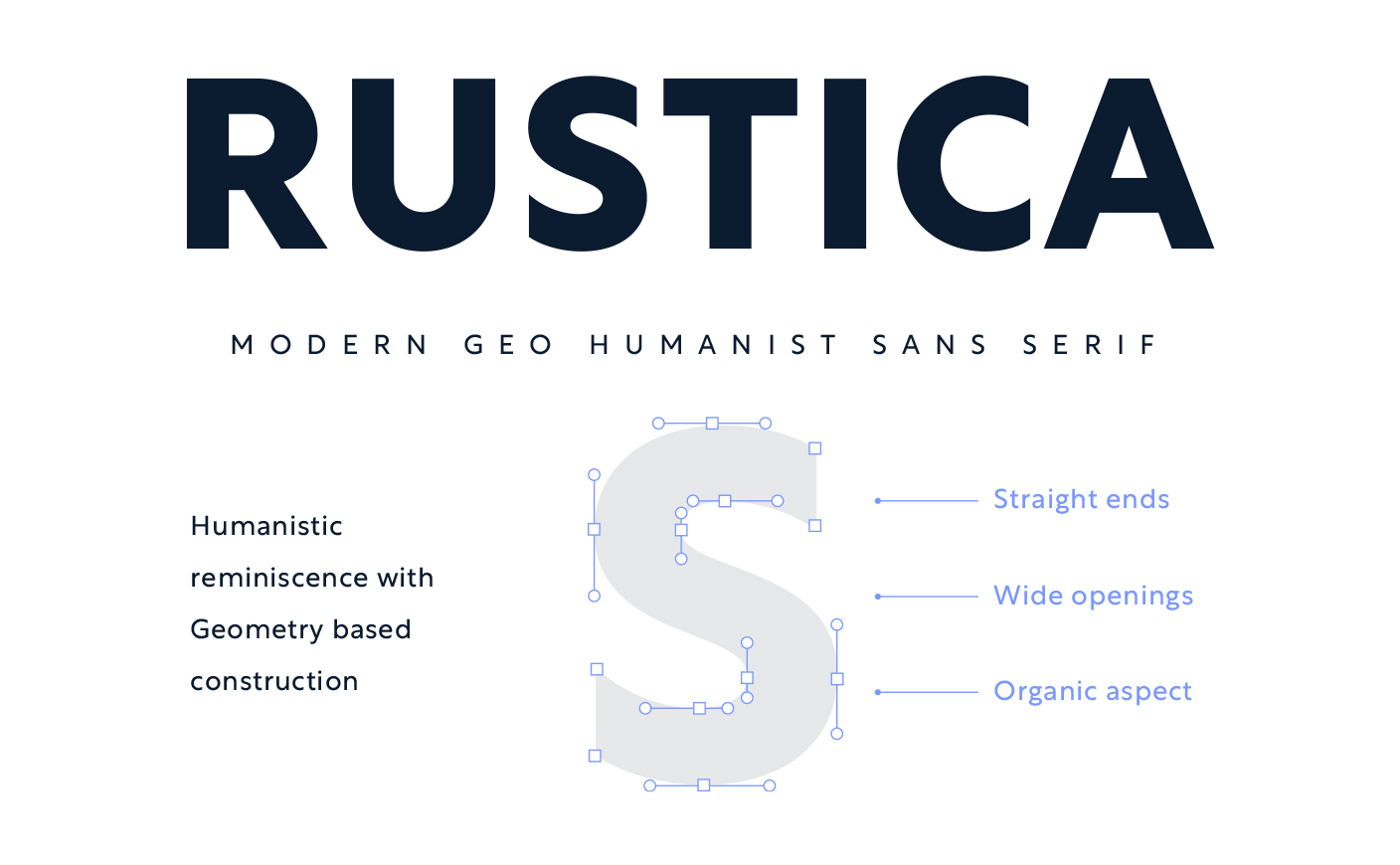
Rustica it’s a GeoHumanist sans serif. Type design looks back at its past to return with renovated strength to its march to the future.
Rustica is based on a humanist architecture with the addition of the determination and precision of the geometry of the classic sans of the early 20th century. Thus, a typographic conception typical of 21st century communications: returning to the human values of closeness and proximity, adding the certainty of knowledge and science.
Images taken from the official Graphéine & Sanctuary on the Moon sites