
Mundial
A typeface of progressive optimism for a connected country
Corporate typography | design: MetaDesign | customer: Airtel
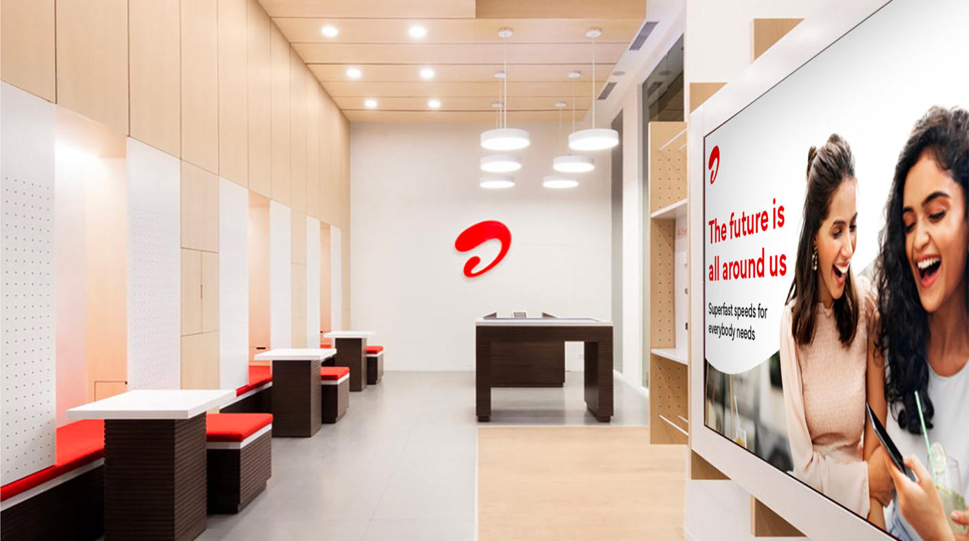
MetaDesign updated the identity of Airtel, a telephone and communications company in India with 364 million users, to adapt its corporate image to technological advances in an extremely competitive market context. Our Mundial typeface was the basis for the construction of Airtel Sans, “its geometric and contemporary shapes reflect the progressive optimism of the Airtel brand.”
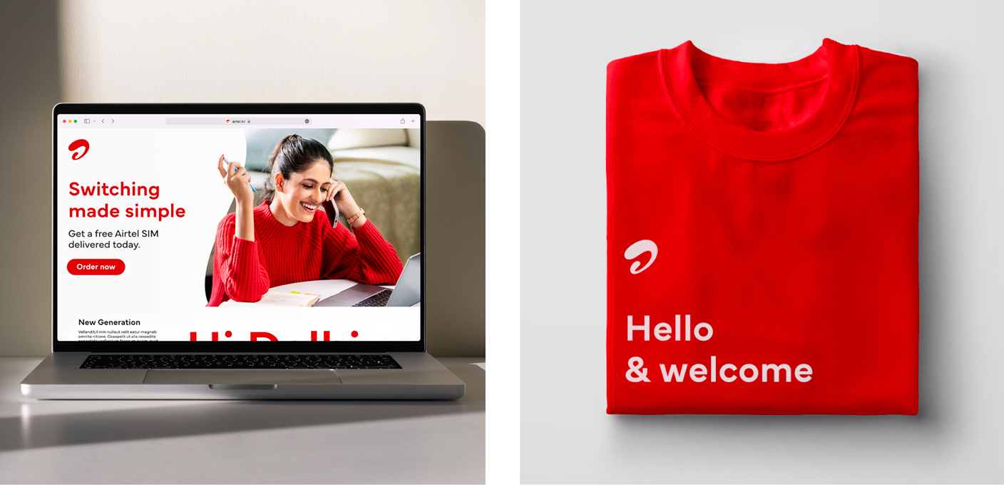
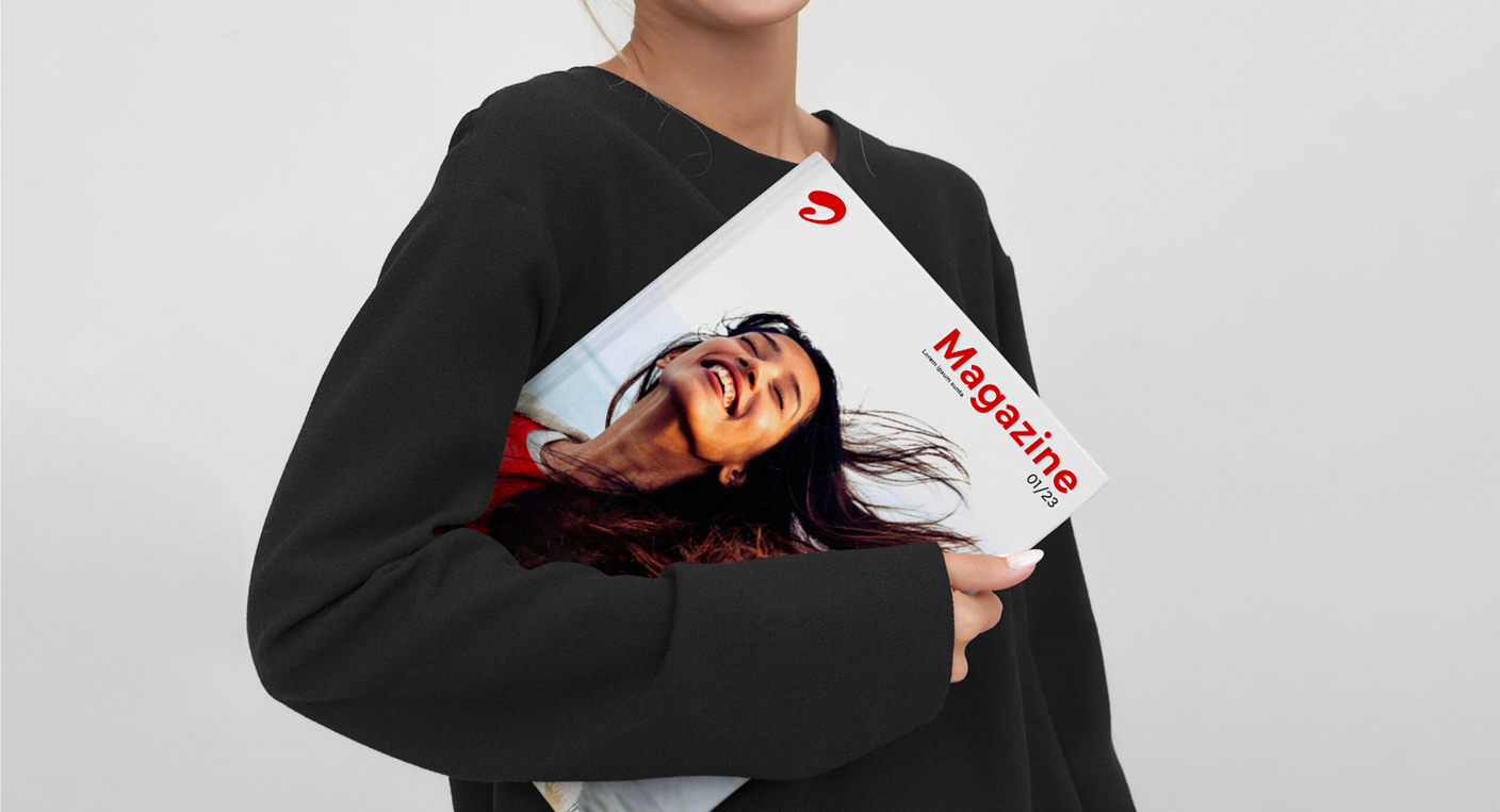
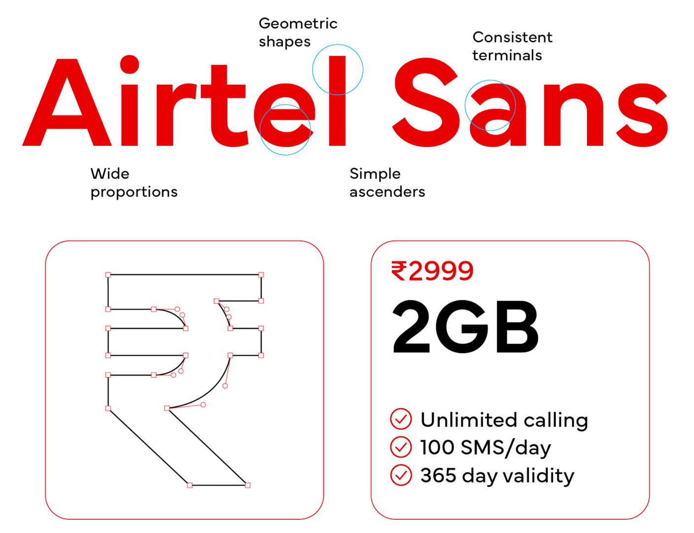
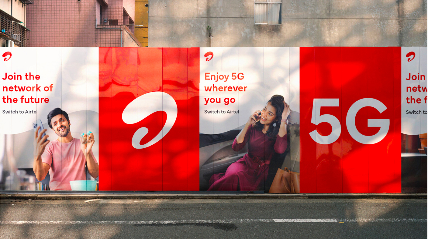
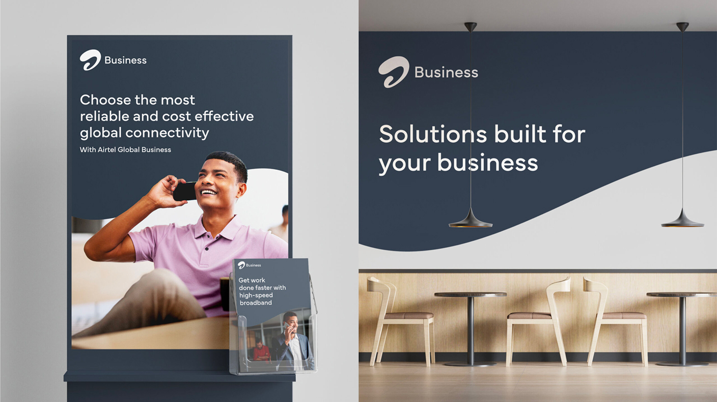
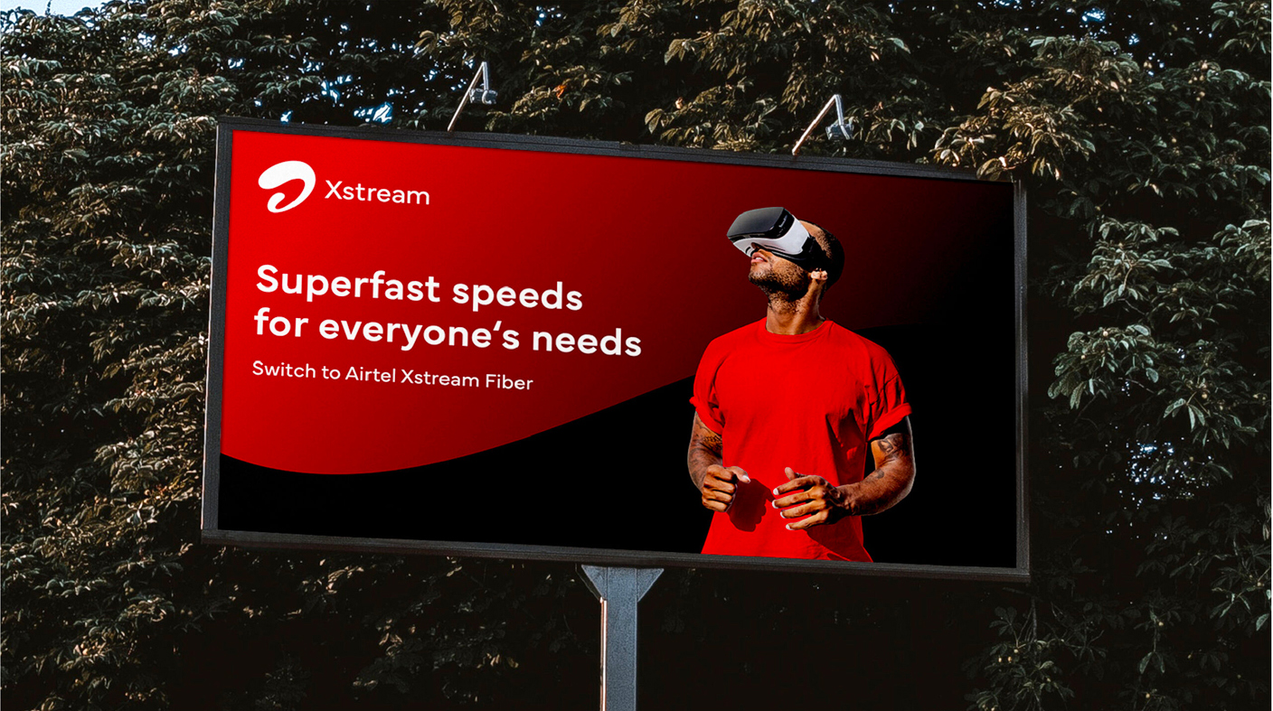
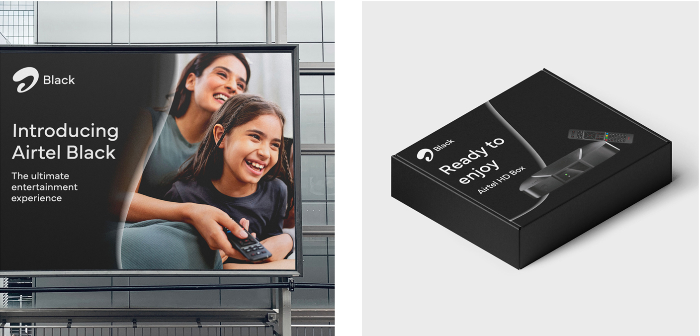
The brand architecture is comprised by the “Black”, “Xtream” and “Business” business lines; for all of them Airtel Sans is the typographic base, which shows that it is a true corporate typeface, capable of tuning different values and communication objectives through a constant and versatile typographic form.
Images taken from the official MetaDesign site